I'm laughing as I think of how ambitious we were to keep up with this blog every couple weeks to track the progress. Let's get this out of the way: there's a lot to be done in this place. We moved in just over a month ago and we've got years of work ahead of us. (Sigh. Years.) But we make a "top 5" goal list every Monday morning and so far, we've tackled everything on the list each week AND kept up with all the recent episodes of Scandal and The Americans. Priorities, y'all.
So we figured the easiest way to throw an update together would be with pictures. They're worth 100 words. Or maybe it's 1,000. I'm not sure of the conversion rate these days.
Exterior (before we moved in):
 |
| Girl, you ashy. |
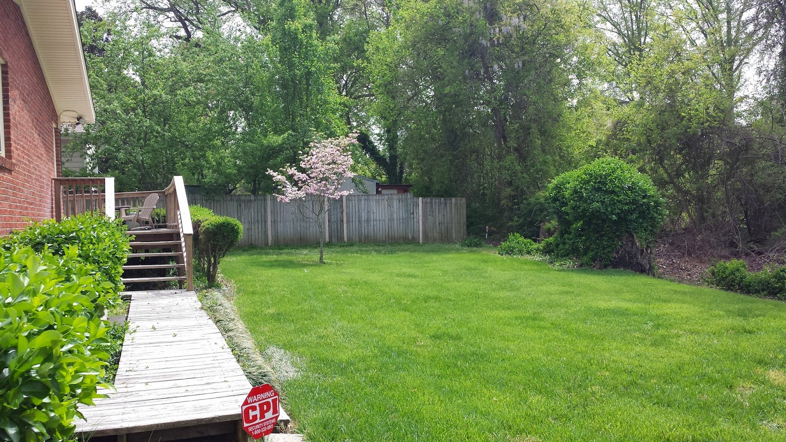
Exterior (now that we're here):
 |
| Groundbreaking... |
 |
| Can we take credit for stuff blooming? |
The only change we've made so far is replacing the house numbers and entry light. (It's worth mentioning that before we moved in and the first week we were here, the entire house had to have a new 200 amp service brought to it and all the receptacles needed to be grounded. So that pretty much took over the house for the first days so we could feel sure we weren't going to blow anything up or start a fire.)
Old brass light: out.
Crazy Sexy Cool globe light wired for damp conditions: in.
 |
| The new digits. |
We've removed a bit of yard art and discovered a butt load of carpenter bees in the back. So if anyone has experience getting rid of those things, I'm all ears.
Entry (before we moved in):
Entry (now that we're here):
 |
| One of the lights was broken in the shipment. |
Another giant brass fixture bites the dust in lieu of this sputnik light. And since we get the question a lot...it's from Lowes. And it's cheap. Or, it WAS. It's gone up in price since we bought it. (Considering there are 18 Edison bulbs that come with the fixture that are typically $6-$8 a pop, that means the actual fixture itself only cost us about $20. See how I justify things in my head?) We have also begun the long process of changing all the almond colored paint in the house to a more modern gray. (Sherwin Williams Repose Gray, if you're curious.)
The hallway (before we moved in):
 |
| It's a beige bonanza! |
As if it were plucked from my dreams, there were hardwood floors under 80% of the existing flooring in the house. New carpet had been put down with in the past couple of years, so while normally, carpet skeeves me out, this stuff was super clean. So, we kept it in the master bedroom, den and Carter's room and ripped it up in the living room, hallway and guest room. It had to be refinished but we got a great deal from a dude. Happy to share his info for those in the market.
In this here hallway though, we still need to paint (thus the tape), install new lights and hang something epic at the end of the hall. I'm thinking an oil painting of Nicolas Cage.
The living room (before we moved in):
The living room (now that we're here):
This room has probably had the most work since we've been here. We've ripped up the carpet and refinished the floors, replaced the light fixture and painted. We've also put things in our built in (swoon!) and are beginning to accessorize. So besides C's room, it's definitely gotten the biggest facelift so far. We still have plenty to do in here (namely some structural support stuff under the fireplace, touching up trim and installing shoe moulding) but we're happy with the direction of this room.
Speaking of...
 |
| That yellow was actually way brighter in person, if you can imagine. |
The end of the original house ended at his room and you'll notice that awkward window in the top picture to the right. The den is on the other side and so it just let in some secondary light (and noise) into the room. I decided it was much too awkward for the layout so we removed it. And by we, I mean Nick and his dad.
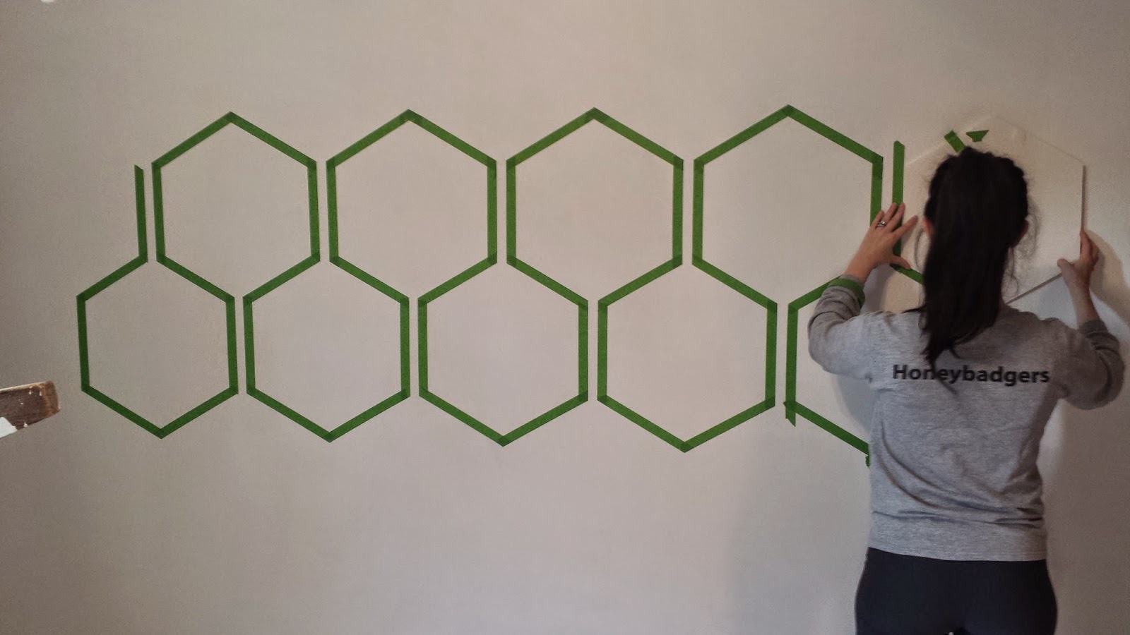
I was still loving the navy from his room @ Glenwood so I used it again here. And used the same taping technique, just a different pattern.
Nick made a pattern out of foam core and then we just tape, tape, taped.
___________________________________________________________________________
And now I'm tired of typing, you're tired of reading and there's a cheese & salami log calling my name. We'll cover the rest of the house in another post. Probably. Or just have all of y'all over to see it for yourselves. MEGA HUGE PARTY!
 |
| (This was clearly Nick's suggestion.) |


Love this! So excited to see your journey through homemakin' and babymakin'...too much?
ReplyDelete